Due to the Covid-19 pandemic, images of viruses are everywhere. For a long time experts have thought carefully about how to represent the antigens that cause sickness. These portrayals range from illustrations of airborne germs multiplying to surgery posters that explain how individuals can help stop the spread of bacteria and viruses. Chris Mugan shows how the way we depict disease has changed since we first recognised the enemy within.
1 of 8
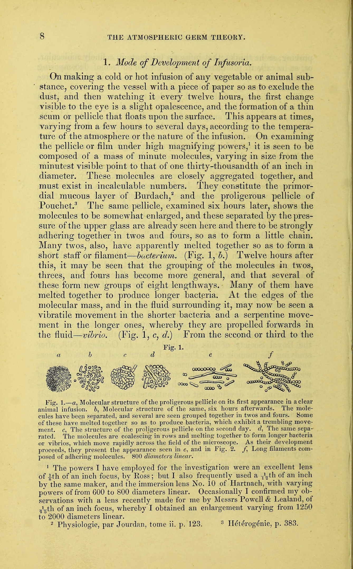
Professor John Hughes Bennett used this image to illustrate the publication of his lecture on airborne germs given in 1868 to the Royal College of Surgeons of Edinburgh, when evidence of such phenomena was a relatively new discovery. Current computer-generated graphics that surround us today seem a far cry from this early engraving of bacteria growing on animal remains, but both are used to convey a warning. Here Bennett uses a series of drawings to show his peers the speed at which bacteria can proliferate.
2 of 8
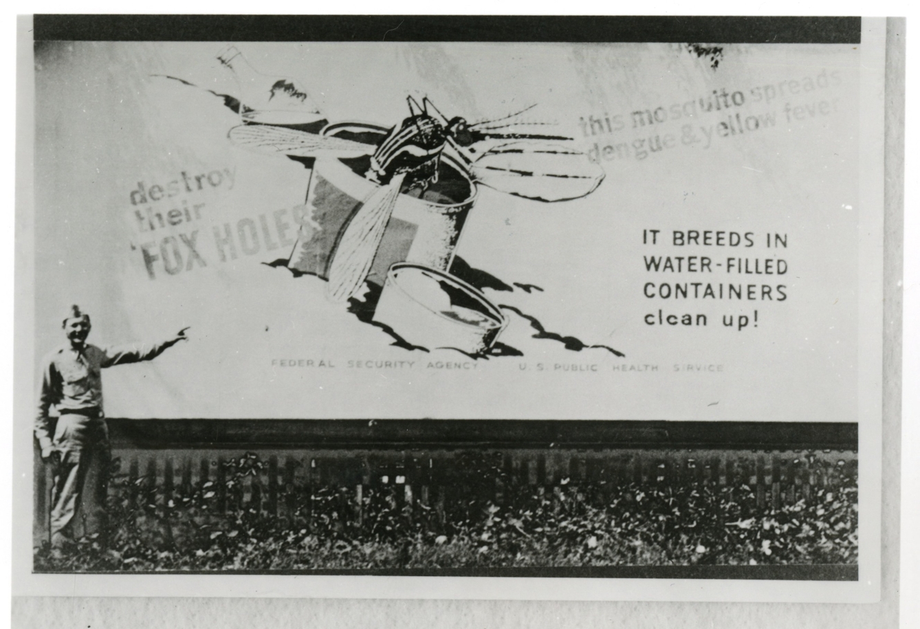
Fighting an epidemic may often be described in martial terms, and armies have long been at war against diseases that can kill their troops even more effectively than enemy action. Before images of antigens became widely prevalent, the focus was on the way that people got infected. Here a serviceman poses by a US Army billboard promoting advice on how to deal with an omnipresent threat to troops – mosquitoes spreading the viral dengue and yellow fevers.
3 of 8
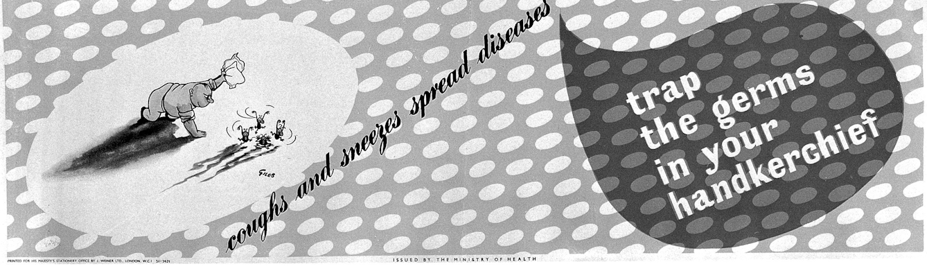
Encouraging the use of handkerchiefs to reduce airborne germs became a vital national interest during World War II, when the health of the armed forces and workers were paramount. The UK government's Ministry of Health was especially keen on humour to encourage people to cover their mouths to prevent the spread of germs. This poster by Reginald Mount and Carl Giles from the 1940s combines an illustration of how to prevent germs spreading with cartoonish images of the antigens themselves, shown as malevolent critters.
4 of 8
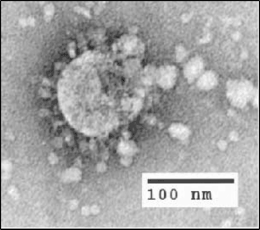
From the end of the 19th century scientists had surmised that viruses, antigens much smaller than bacteria, must exist. But it was only the invention of electron microscopes during the 1930s that allowed us to witness their form. The discovery of the coronavirus family came three decades later. This image of a section of a SARS virus within an infected cell clearly shows the spherical particles radiating from its centre that inspire today's crenellated images.
5 of 8
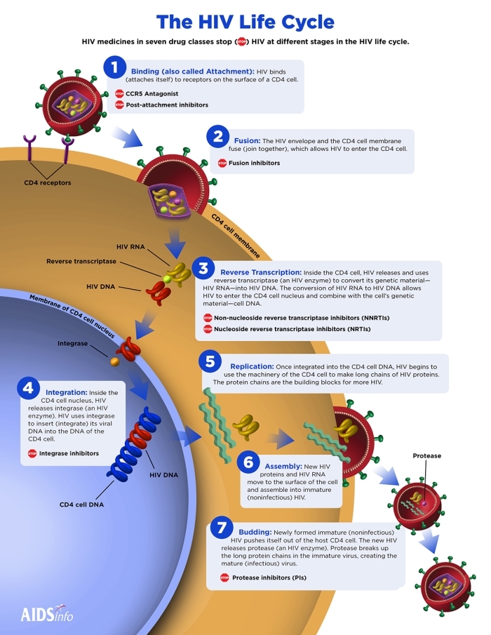
Among the most complex antigens are retroviruses. The most infamous is probably HIV, which causes AIDS. Discovered in the early 1980s, the virus requires a variety of drugs to combat it over its life cycle, so organisations fighting the AIDS pandemic have condensed a lot of information into digestible forms to explain how the virus works, as with this infographic devised by the US Department of Health and Human Services.
6 of 8
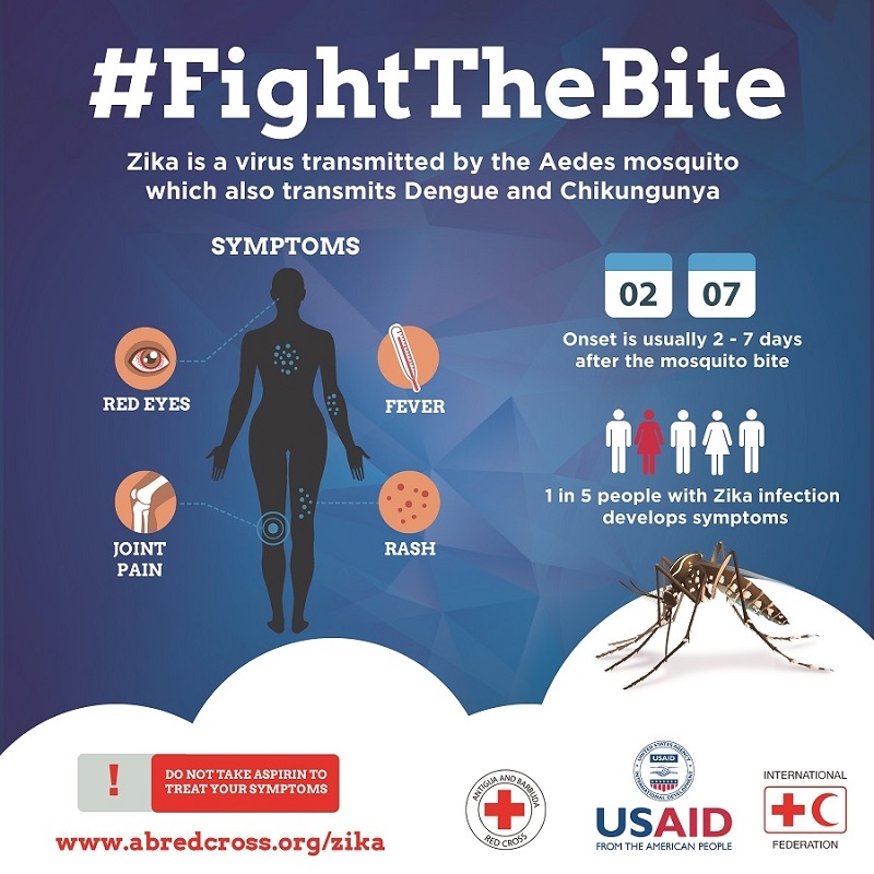
Often, even now that we know what antigens look like, images of a particular virus are less important than awareness of how it spreads or particular symptoms to watch out for. This was the especially case with Zika, which spread across the Americas during a 2015 epidemic. The disease was mainly transmitted via mosquito bites, which is why images of that insect remain relevant today, as in this poster distributed by the International Federation of the Red Cross.

7 of 8
In other cases, designers try to motivate people to follow advice by depicting the danger of the virus. This poster was designed in 2018 on behalf of multinational vaccine firm Valneva to help UK healthcare professionals raise awareness of the continued threat of yellow fever. The virus’s spiky exterior forms a punky hairstyle for this alarming beast as the poster designers continue the tradition of portraying antigens as predators. This one has fangs alongside insectoid legs that suggest swift movement.
PHIL ID #23311, Alissa Eckert, MSMI; Dan Higgins, MAMS. Public Domain Mark.
8 of 8
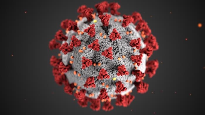
One of the most widespread images of the virus SARS-CoV-2 was devised by specialist medical illustrators at the US Centers for Disease Control and Prevention with the express aim of raising public awareness about the cause of COVID-19. While the virus has not been made to look like a dangerous animal, its striking colour scheme was devised to grab attention. The emphasis on its spikes, based on the antigen's actual S-proteins (or spike proteins, which cover its outer membrane), hint at the danger contained within.
About the author

Chris Mugan
Chris Mugan is a freelance journalist with interests ranging from art and music to travel and design. He has written on these areas for publications including the Independent, the i newspaper, the Financial Times and Art Quarterly. Chris has also contributed to books on fine art and design published by Phaidon.