Home Part 2 of Inclusive Exhibition Design Toolkit
Threshold and signage

Living with Buildings threshold, Thomas S.G. Farnetti. Source: Wellcome Collection. Attribution-NonCommercial 4.0 International (CC BY-NC 4.0).
Principles for thresholds
We want our visitors to feel welcomed and confident at the threshold of every exhibition.
This means we consistently provide the following key elements:
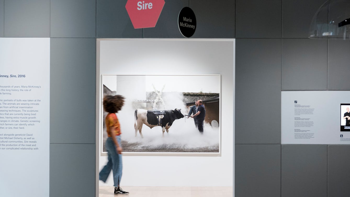
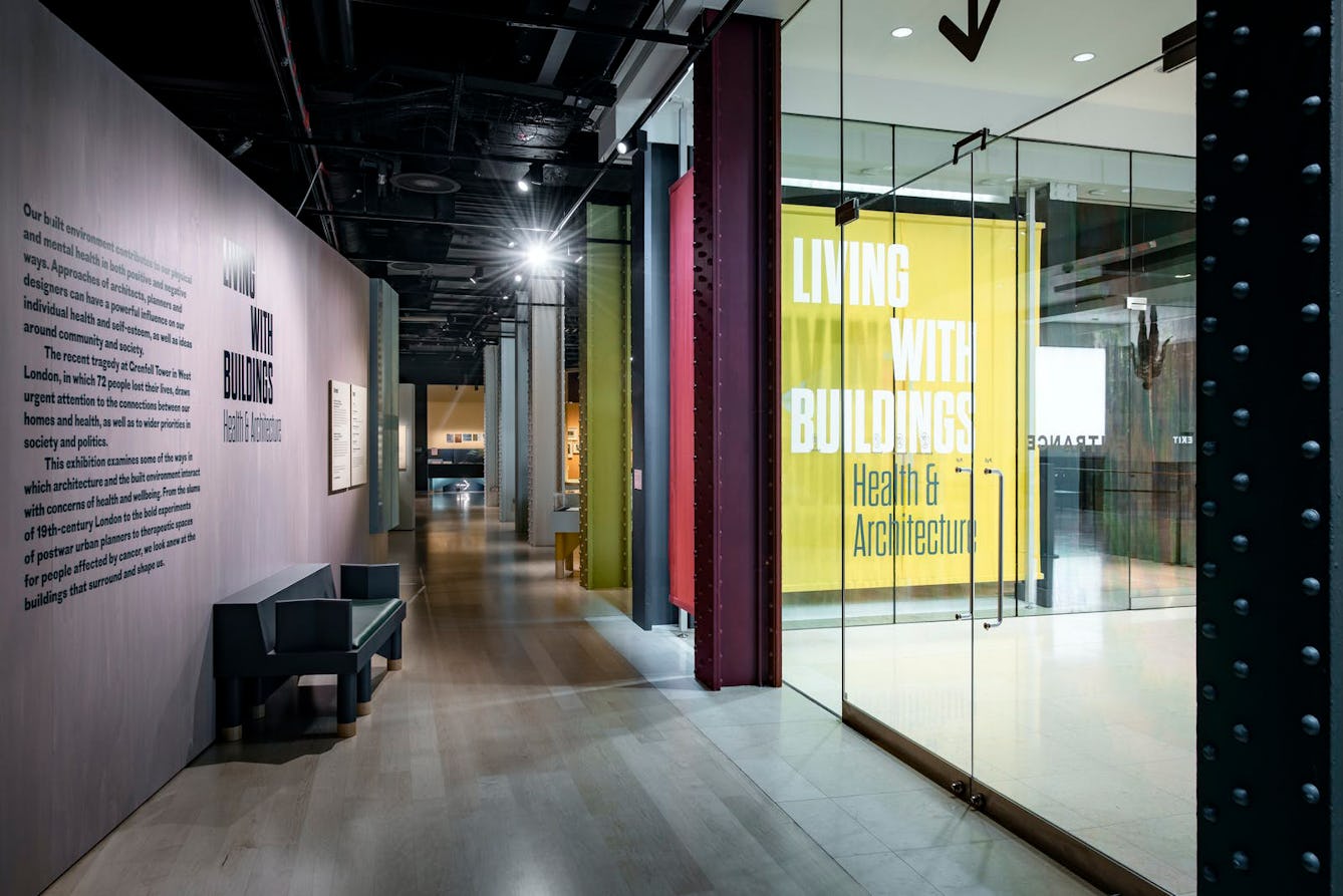
- Clear signals that the gallery is open
- Visual cues to link the threshold to the marketing campaign so that visitors know they’ve arrived at the right place
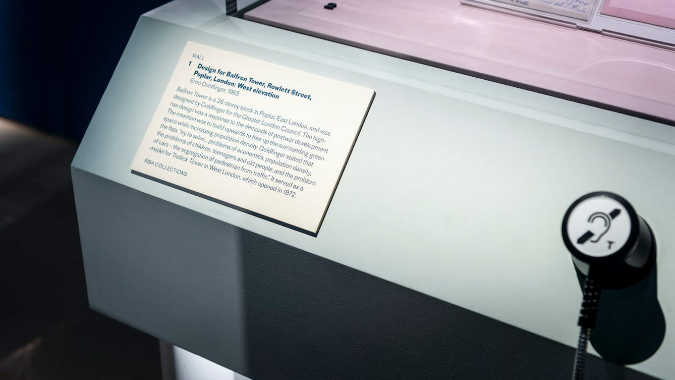
- Clear and consistent signage to indicate where to enter/exit and whether to push or pull the doors
- Communication of gallery rules (no photography, no food/drink, do not touch)
- Warnings of sensitive or explicit content or significant environmental effects (low lighting, strobe)
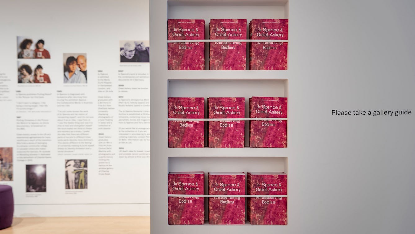
- Easy-to-find distribution points for gallery guides, large-print guides and any other handheld interpretation
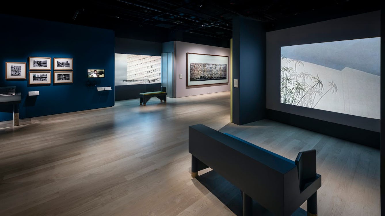
- Good views through the space so that visitors can understand the exhibition layout, including the locations and frequency of rest stops
Thresholds for Gallery 2
Gallery 2 has two thresholds. The east lobby is primarily accessed by the spiral stairs and the core lobby is easily accessible by lift. When both entrances are in use, the two thresholds should be given equal status. If it is necessary to use a single entrance, we consider how signage can be used to direct visitors to the exhibition’s start point.
Locating gallery guides and large-print guides in the exhibition space
Gallery guides and large-print guides should be distributed from points that are easy to find (not obstructed, in high contrast with their surroundings and clearly signposted). The two should be co-located and given equal status.
Guide distribution shelves or boxes should be clearly visible from the exhibition entrance.
If there is a large-print guide for each section of an exhibition, these should be located alongside section text panels throughout the exhibition.
Directional signage
We produce instructional and directional signage in a consistent style for every exhibition at Wellcome Collection:
- The font is Neue Helvetica 75 Bold
- Sizing can vary for different usage but should be clearly visible
- Maximum contrast in colour should be used
- We use a combination of clear text and simple symbols
- Consistent messages for all galleries: Entrance/Exit and Push/Pull, No food or drink, No photography (if applicable), CCTV in use
- Particular messages or warnings about the exhibition’s content (such as ‘This exhibition includes sexually explicit content’ or ‘This exhibition contains human remains’)
- Particular messages about the gallery environment (such as ‘In the interest of object care, low lighting is used across this exhibition’ or ‘This installation includes strobe lighting/loud intermittent sound’)
- Consistent signage through the exhibition: Do not touch/Please touch; No photography (if applicable); Induction loop (where applicable).
Download the template for directional signage: